Endangered Languages Project
For language communities, the platform needed to feel personal and welcoming: a place to share recordings, writing systems, oral histories, resources, and knowledge about a language they cared deeply about. Contributing shouldn't feel like filling out a database form.
For researchers, the same platform needed to feel structured and trustworthy. They needed to browse information across hundreds of languages, understand the status of each language, compare data, and assess where information came from.
The challenge was designing one experience that could support both cultural ownership and academic rigor without feeling like two separate products stitched together.
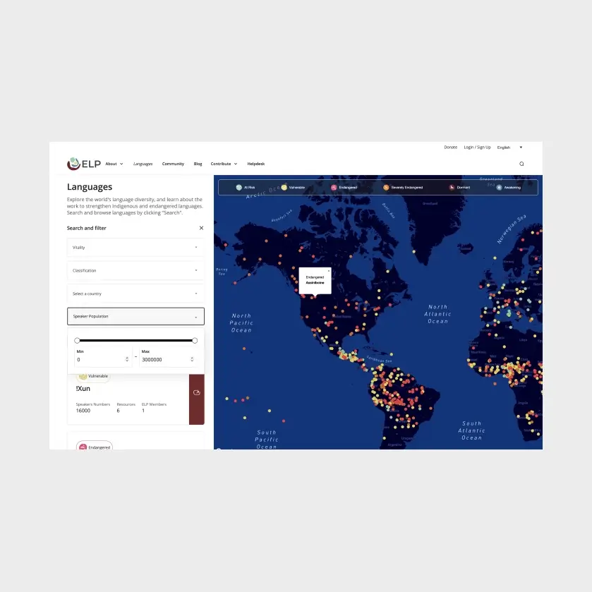
Platform
Wordpress
Team & Role
Communications Director (ELP team)
Communications Coordinator (ELP team)
Product Manager (My role)
Senior Software Engineer (My team)
Junior Software Engineer (My team)
Senior Product Designer (My role)
Junior Product Designer (My team)
Timeline
6 months + 6 months v2 extension
Problem Space

ELP members needed a place to document and share resources about their language, recordings, writing systems, oral histories, and to find and connect with other people doing the same work for that language. That side of the platform needed to feel personal and low-friction: community members aren't filling out a form, they're contributing to something they care about.
Language researchers needed the opposite. They needed to browse verified data across hundreds of languages, understand how endangered each one was, and trust that the information was sourced correctly. That side needed to feel rigorous and structured.
Both groups met at the same artifact: a vitality score, calculated per language and surfaced on every language page. Designing one interface that served a contributor's pride and a researcher's need for rigor, without feeling like two different products stitched together, was the core design problem.
The Vitality Score Problem
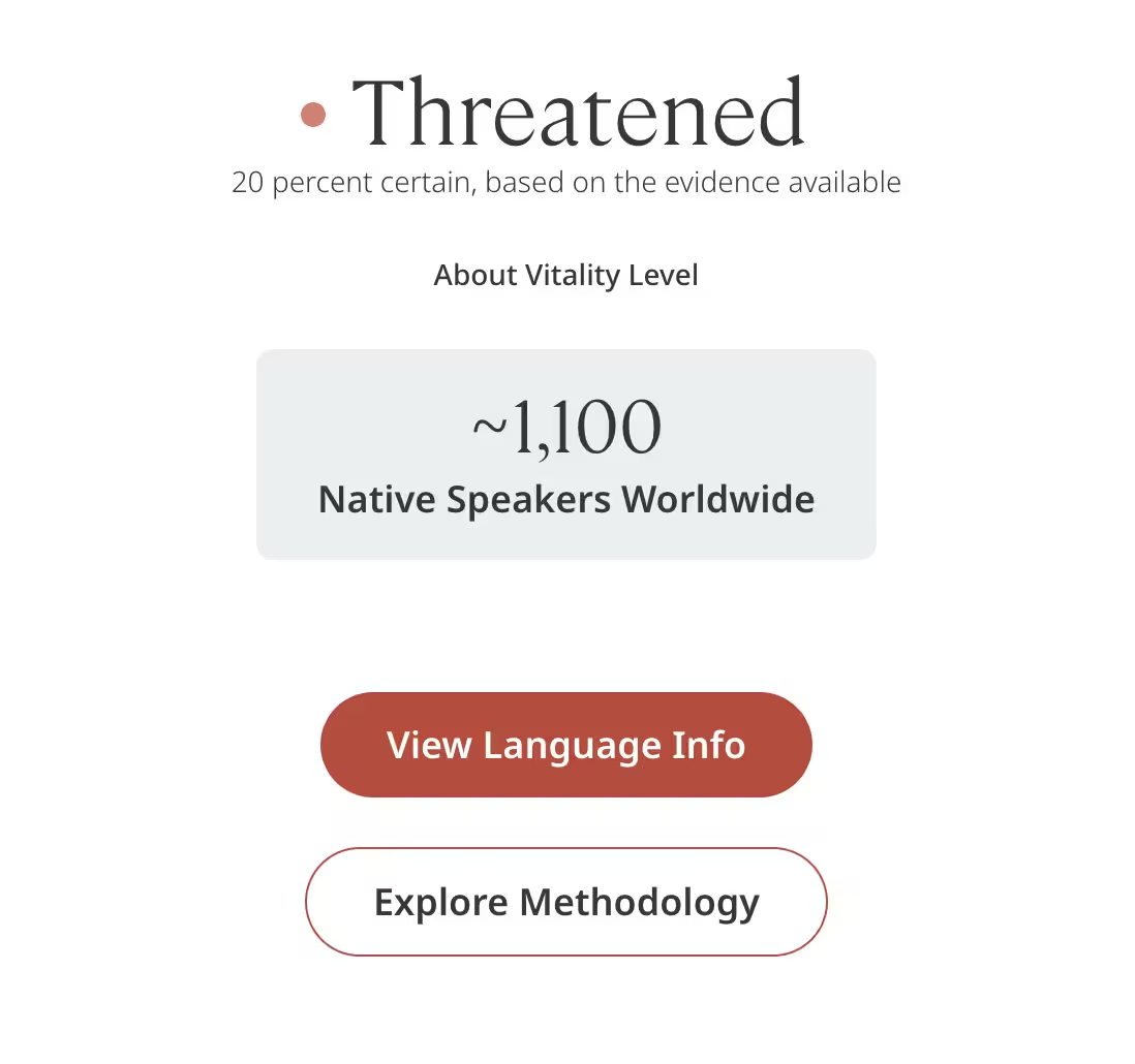
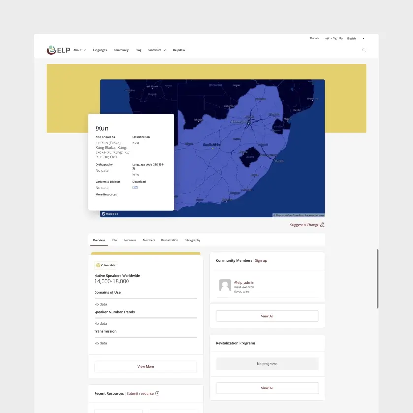
A vitality score is a rating of how at-risk a language is of disappearing, calculated from factors like number of speakers, intergenerational transmission, and documentation. Both ELP's admin team and community members needed to input this data through WordPress, and the score needed to surface clearly on every language's public page.
This created two design problems at once:
For researchers, the score needed to be scannable and comparable across languages, someone browsing hundreds of entries needed to understand relative urgency at a glance, and trust where the number came from.
For community members, the same number could land very differently. A low vitality score is, for the person who speaks that language, a statement about the survival of something deeply personal. The UI couldn't treat it like a stat on a dashboard, it needed to feel respectful, not clinical, while still being accurate.
What We Learned
We ran a UX survey on Typeform, then 5 stakeholder interviews and 6 user interviews over Zoom to understand both audiences directly.
The clearest tension to come out of research: community members wanted to feel ownership and pride in their language's page, something closer to a personal or cultural profile. Community members did not necessarily trust foreign researchers.
Researchers wanted provenance and structure: clear sourcing, comparability, and confidence in the data. Both needs had to be served by the same UI patterns, which shaped the platform's visual language: informative but friendly.
Product Strategy
- Research existing platforms and break down client briefings
- Conduct stakeholder and user surveys and interviews
- Create user personas based on UX research
- Walk each persona through key user journeys
- Generate and sort user stories and epics
- Translate user stories and epics into wireframes
- Translate wireframes into high-fidelity designs
- Develop live prototype in Webflow
- Develop final product in Wordpress
- Collect feedback at each step

Survey & Stakeholder and User Interview

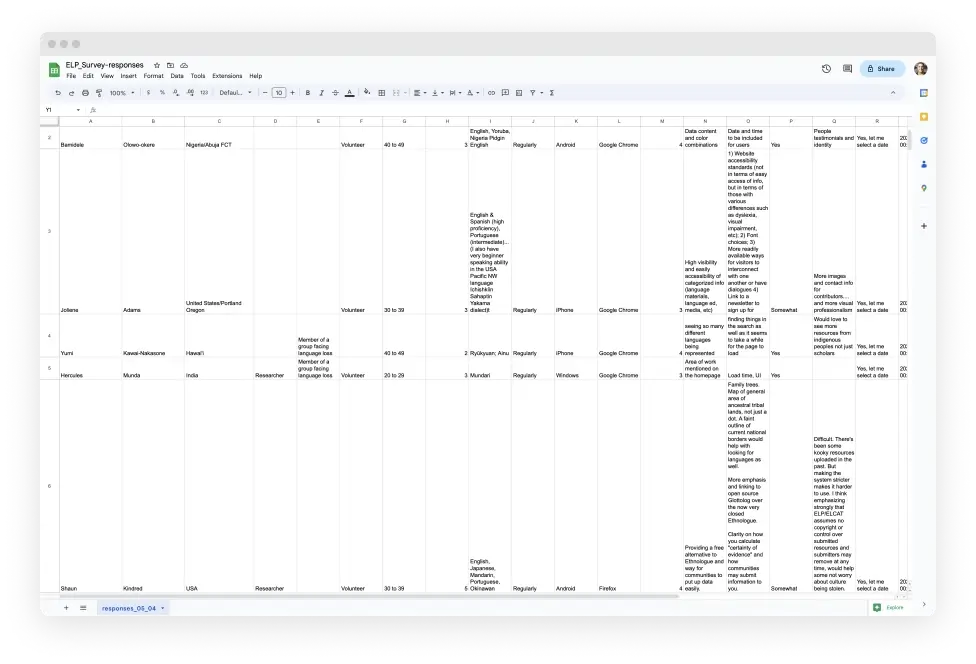
We first asked users and stakeholders to complete a UX survey, to get to know them better and learn more about the space. The survey was conducted on Typeform and the results were exported to a CSV file. After reviewing all survey results, we conducted stakeholder and user interviews: 5 stakeholder interviews and 6 user interviews.

Survey and Interview Insights

Persona Development
From this research we developed three personas to keep these different needs concrete throughout design:
- Cultural Carlos — an endangered language community member, motivated by pride and preservation, needs low-friction ways to contribute
- Research Rebecca — a language researcher, motivated by data integrity, needs to browse, compare, and trust sourcing
- Helpful Helena — a language preservation volunteer, motivated by contribution, sits between the other two needs


Identifying User Journeys
To create the user journey map, we used a variety of tools and techniques, including user flow diagrams, storyboards, and journey maps. These tools helped us visualize the user's happy path through the product, and identify potential pain points or areas of friction that needed to be addressed.
User Stories
User stories were a vital part of the process because they translated the users’ needs into a wealth of potential product functionalities. ELP stakeholders, language researchers, and designers were all encouraged to participate and guided to write out as many user stories as they could think of. Anthony and I later on cleaned and organized chunks of related user stories, these would become our Epics.

From Epics to Wireframes
Each Epic, such as the ‘Language Page’ or 'Create a Language’ epic, was then translated into a set of wireframes. The wireframes were then shared with the team and users for feedback. Early wireframes tested a single dense layout; feedback from community member reviewers said it felt too "form-like." We used the feedback to iterate on the design and move from hand-drawn wireframes to Hi-fidelity screens.